Electricity capacity charge – peak shaving wrap up
Our analysts worked hard during the 2020/21 hot season to predict peak shaving days. The hot season has now concluded, and the peak interval data is starting to flow in. Amanda customers in the Beat the Peak and Shave and Save programs will be provided in May with an analysis of the dispatches given, the load reduction performed and the likely result in the dollars saved or the dollars credited. In the meantime, we take a look below at some of the interesting factors of the 2020/21 hot season and the changes from previous seasons.
If you’re not sure what the electricity capacity charge is and how it affects your electricity price, have a read of our February 2021 article ‘Understanding the electricity capacity charge’.
2020/21 Hot season wrap up
Hot season comparison
During the 2020/21 hot season we saw a consistent distribution of the top 10 peak grid consumption days across Dec – Feb:
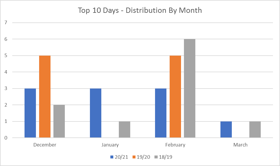
This is in line with what we expected for a moderate March. As touched on in our February article, overcast days can move the peak days into March. This is due to the prevalence of behind the meter solar (approximately 1.4GW as at the time of publication).
2019/20 had a strong concentration of high demand days in December and February, while 2018/19 (unusual year due to very low demand) had a high concentration in February.
The monthly distribution makes sense when comparing the Perth metro temperature data for each of the hot seasons:

As discussed in our February article, the WEM is very temperature dependant. That means there’s a strong positive correlation between temperature and peak demand.
For instance, looking at the data above we can see why the 2019/20 hot season had a strong concentration of peak days in December and February.
It’s also pleasing to see that weekends (and public holidays) haven’t featured in the top 10 for the last two years. Weekends and public holidays make forecasting peak days very difficult.

Tuesdays were the day to watch out for during the 2020/21 hot season.
The chart above clearly shows why 2018/19 threw our forecasting out. During the 2018/19 hot season we had a Saturday and a public holiday feature in the top four.
In terms of peak demand across the top 10 days, the results were consistent with the 2019/20 hot season.
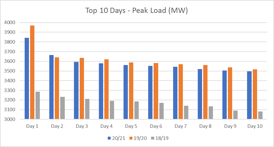
As you can see above, the 2020/21 and 2019/20 hot seasons followed the same pattern. We saw one extremely high demand day and a large drop to the next highest. The difference between the highest and the second highest demand days was 9% in 2019/20 and 5% in 2020/21.
The demand through the 2018/19 hot season was extremely low in comparison. As we’ve discussed with many customers before, this made the hot season very difficult to forecast.
We’d like to know what the top 10 would have looked like without the snap COVID lockdown in February. Amanda Energy believes the lockdown reduced peak demand by approximately 6%. Without this, we think the 1st of February would have been the second highest day (instead of the 5th) and the 2nd of February would have been the 6th highest (not featured in the top 10).
The forecast peaks
The top four days haven’t been published yet but based on the data we do have; we can put a forecast together.
We’re pretty sure the following days will be the top three:
| Day | Period |
| 23/12/2020 | 17:30 – 19:00 |
| 24/12/2020 | 17:00 – 18:30 |
| 08/01/2021 | 17:30 – 19:00 |
The fourth and fifth highest days are pretty marginal, but we expect one of the following two will feature in the top four:
| Day | Period |
| 01/02/2021 | 17:30 – 19:00 |
| 23/02/2021 | 17:00 – 18:30 |
How did Amanda do?
In all, 15 peak demand warnings were given a day or two before a potential peak day. Three were cancelled due to changes in the weather and the grid load. A further six were reduced to 50% or less probability.
In summary, six warnings with a greater than 50% probability, could produce a 100% result. It is likely that these six will produce a $0 Capacity charge (if your load dropped to zero during the dispatches).
How is that possible you might ask? The IRCR is calculated using a median of the 12 intervals and thus if you dropped your consumption to zero for more than half of the intervals (seven or more), the median will be reduced to zero.
The impost of performing a dispatch is front of mind for our analysts. After consultation with industry, we decided the best methodology would be to rate the likelihood of a dispatch being a peak interval with a percentage. That way, as conditions changed, the percentage could be varied to help customers decide if they thought performing the dispatch was worthwhile effort for reward.
The percentages ranged from three cancelled days (the likelihood dropping to an unreasonably low level) with the final percentages ranging from 20% to 95%. Obviously, a 100% prediction cannot be made until possibly the last few days of March when the previous highs are known.
We welcome feedback from customers on the concept of issuing percentages, and any improvements we can make.
We now look forward to giving our customers in the Beat the Peak and Shave and Save programs an analysis of the dispatches given, the load reduction performed and the likely result in the dollars saved or the dollars credited.